Sunday, March 27, 2011

Babies, Buttons and Bows

I posted earlier in the week, that there was a run on baby challenges. Well, here is my next completed Baby Card for the City Crafter Challenge Blog. Their challenge this week was to create a baby card with buttons and bows.

I wanted to do a totally unique baby card...hence the red and gold. I just can't resist the image of the little girl drinking her milk and the kitten eagerly awaiting the drops. :o) Perhaps I should have said "Sweet Babies."


Sometimes it is fun to make a card that is not done in the "expected" colors or the "expected" sketch. What do you think? For Now, Happy Crafting!

Saturday, March 26, 2011

A Clean and Simple Birthday Card

Many times, it is true...."Less is More." That is exactly the premise behind creating a Clean and Simple (CAS) card. The focus is on the design, not the number of layers, not the number of buttons and not the number of bows. Using that idea, I created this fun Birthday Card.


I wanted to create a card where the focus would be on the message of this card. There are not multiple layers or embellishments to distract the eye from the cute little bunny giggling as he is thinking about the recipient's age. hehehe...

To make this card, I started out with a 5 1/2 x 4/14 inch base of Colonial White. I used Sunset and Lagoon card stock and a small strip of pattern paper from Magnifique. The bunny is from CTMH's current STOM called Sensational Season. It is a wonderful stamp set designed for Easter. But, as you can see, I was able to use the image for the birthday card. It is quite a versatile set. It is only available through the end of the month and you can see the full stamp set on my website. Anyway, I used the word bubble that is contained in a set called Party Animal and letters from the set called Tiny Typewriter. "Fifty is Nifty" is from a retired CTMH set that was in my stash.

Challenge Day 24 at 365 Cards blog was to complete a card using these letters of the alphabet...M = Markers, N = Numbers and O = Orange. What a cute challenge. For the "M," I colored the bunny with my Copic Markers. Fifty is the Number and I highlighted the card with orange (sunset.)

A Clean and Simple design really helps you add focus to the images on your projects. In many cases, less really is more. For Now, Happy Crafting!

Thursday, March 24, 2011

Hope For Japan


Just wanted to let everyone know that the "Hope For Japan" stamp designed exclusively to support disaster relief in Japan is now available. It is an "A" size stamp set and is $5.00. Normally a stamp that size is $7.95. One hundred percent of the profit from this stamp will be donated to the Red Cross for relief effort. You can order it form my website or email me and I will order the stamp for you. Hurry, because it will only be available through April 30th.
What a wonderful way to support those in such need. For Now, Happy Crafting!

Repeating Elements in a Monocromatic Color Scheme Card

One of the color theories I teach is how to pick colors that work well together. The simplest way to ensure that you get a color combo that works well together is to do a monochromatic color scheme. That is, use only one base color on your project. If you make a card or scrapbook layout that uses the tints (the base color which is lightened with white) and shades (base color that is darkened with black) you are sure to get a card that coordinates beautifully!

Today, I found a sketch challenge at Card Patterns Sketch Blog that helps me demonstrate this idea very easily. First here is the sketch...


And now for my card...
I combined 2 shades of green...CTMH's New England Ivy and Sweet Leaf to complete the monochromatic look. The pattern paper is the Sweet Leaf side of one of the sheets from the Wings paper packet.

In order to add some interest to the 2 shades of green, I repeated the "dot" elements found in the pattern paper by embossing the darker New England Ivy with my Cuttlebug Swiss Dots folder. The ribbon I used even helps to carry the "dot" theme. Lastly, I selected the snail image on purpose for this card. Do you see how his body is circular and his eyes are dots? Once again, the image helps to carry the theme.

Using monochromatic color scheme on a project is a sure way to ensure that your colors will always "match." Make sure you repeat a simple element, at least once...twice is better, in order to add interest and texture. BTW - a shout out to Card Patterns Sketch blog...I love this sketch. For Now, Happy Crafting!

"Hope For Japan"

One of the many things I love about Close To My Heart is the company's philanthropic nature. Once again, in response to the tragedy in Japan, CTMH has come up with a way that we can all help.


Normally, an "A" size stamp set sells for $7.95. This exclusive "A" size stamp has been designed and will sell for $5.00. All of the profits, yes 100%, will be donated to the Red Cross for Japan's Disaster relief. I will have more details about how you can get this stamp set later today, but I do know that it will be only available through April 30th.

What an easy way to show support for those that are in need. Stop back later or email me for more details. For Now, Happy Crafting!

Wednesday, March 23, 2011

Thank You Card With Mayberry Paper

The never ending quest to find more challenges. This morning was no different and here is one of the cards I've made today.


This unique thank you card is done in shades of Honey and Cocoa and the Mayberry CTMH paper packet. The window box image is from a stamp set called "Flower Pot." The flowers were first stamped and then the pot was stamped on Cocoa card stock, cut out and sanded to give the aged look. I attached it just at the stems to give it a realistic look. The Mocha Opaques were added to the centers of the flowers for just a touch of bling.


The sketch I used is from one of the challenges I found this morning on the Get Sketchy Blog. Quite an interesting sketch, don't you think? :o)

The other challenge I found this morning is called the ABC Challenge. This week's challenge is called "Q is for Quilting or Sewing." It gave me the opportunity to try out this new gizmo I bought that pokes the holes in the paper for hand stitching. More about my new toy in a later post.

I am really enjoying finding all of these new challenge blogs and the wonderful artwork I am finding! For Now, Happy Crafting!

Tuesday, March 22, 2011

Oh Baby...A Close To My Heart Baby Card

As you know, I've been doing all kinds of challenges recently. I love challenges. I think they enable you to see not only the creative work of others, but also, helps you increase your ability to "think out of the box." Challenges help you to explore what is in your stash, help you to find ways to use your supplies that perhaps you hadn't thought of and try some ideas and techniques that you wouldn't have done.

Having said all that, I've noticed that for some odd reason, this week I am finding "baby" challenges. So, expect to see a baby cards from me in the next few days. :o) Here is my first...


Over at 
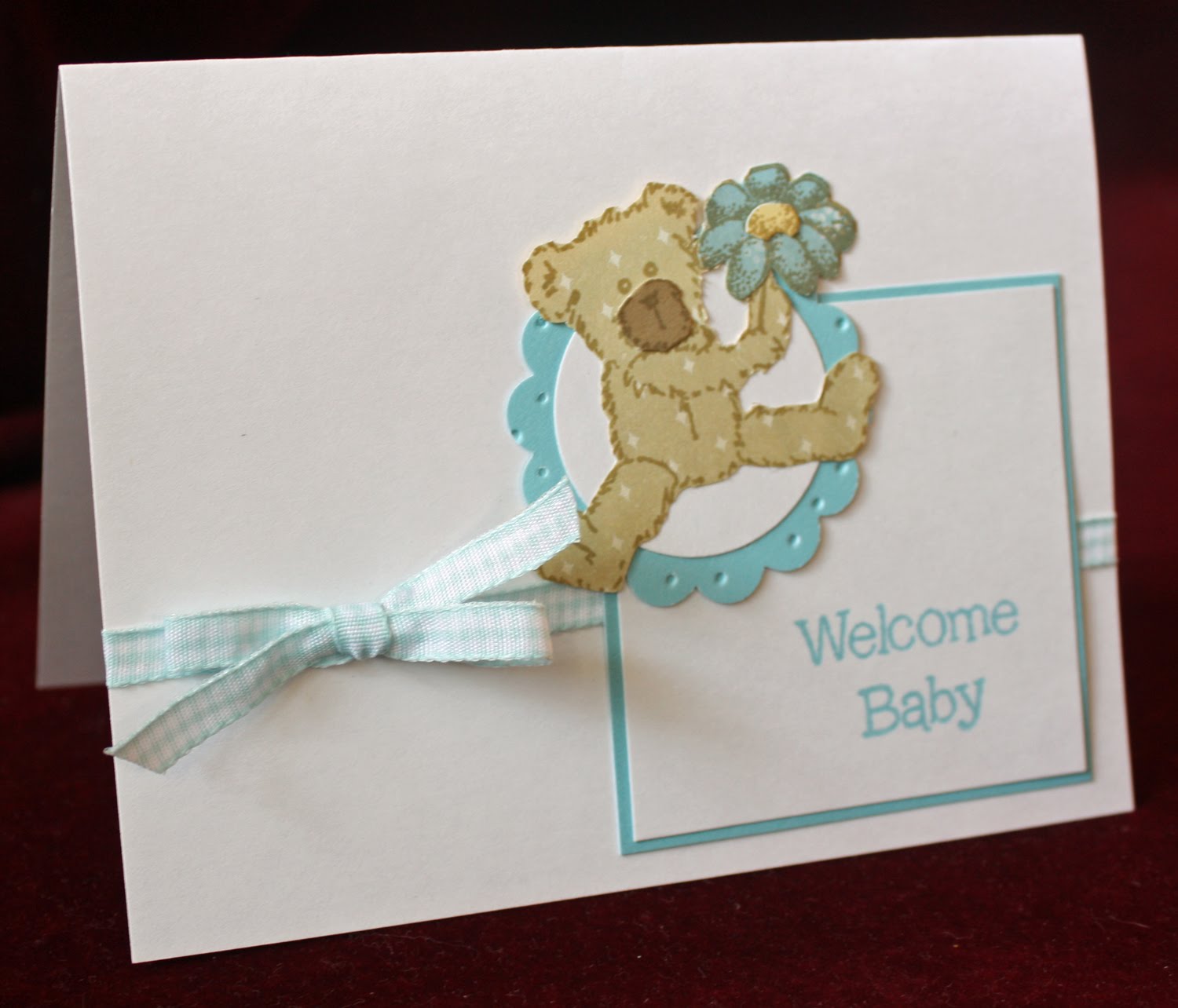
365 Cards, the challenge Day 21 was not really a "baby" challenge but it screamed baby to me the minute I read it. It is called the "ABC's of Crafting." We were to use at least one of the following...letter stickers, something blue and a circle. I immediately thought of those old fashioned wooden baby blocks. Do they still make them? I cut squares of bamboo card stock and scored it on the 1/16th inch mark all the way across. I also scored the edge on all four sides to create the illusion of a block. After sanding and ink distressing, I attached the sticker letters A, B, C that were inked in Sweet Leaf, Crystal Blue and Sorbet. Faux baby blocks... Using my Cuttlebug, I embossed 2 layers and scored the other. The image is from a Close To My Heart set called "Sweet Baby." I attached the Sorbet ribbon and the card was done.

The Heart 2 Heart Challenge blog's theme for the week is also "Babies." The requirements for that challenge weren't quite as specific...Just a card with a Baby Theme.

The point of this card, almost like my last post, if you think about what is in your stash and add a touch of creativity, you can always rise to the "challenge." Hence, my faux baby blocks. For Now, Happy Crafting!

Monday, March 21, 2011

City Crafter Challenge #48

Well, I have to say that this week's challenge over at City Crafter Challenge Blog has had me going... :o) The challenge this week is to create a card with a crown. I rummaged through EVERY stamp I owned and didn't have one crown! AHHH...next I turned to my Cricut and finally found something!


The card is a 4 1/2 x 4 1/2 inch trifold base. The cartridge I used is called Paisley. Each Cricut cartridge has different options for images, cards and shapes...all depends on the individual cartridge. This particular cartridge has the option for the trifold card. The crown is cut from the center and there are small cuts and a tab on the back. I then used another option to cut the pattern paper image to place over the White Daisy card stock base. I lined the "hole" created by the crown cut out inside with white glitter paper. I gathered the pink ribbon, added the beads to the jewelry finding, attached the photo clip and buttons and lastly matted the sentiment.

This card proves that you can't ever "forget" what you have in your stash! :o) Thanks again to the gals at City Crafters Challenge. For Now, Happy Crafting!

Friday, March 18, 2011

Close To My Heart Accordion Album

I haven't been around much in the last few days, but that doesn't mean that I wasn't crafting! I've spent the last few days putting the final touches on tomorrow's workshop called a Perfect Day Accordion Album. Here is what we will be making tomorrow...


The paper packet we will be using is regretfully retired, but I was able to secure a number of the packets at a reduced rate. My goal was to introduce my participants (many of whom are new to Close To My Heart) about the value of a CTMH paper packet...12 sheets or pattern paper and 10 sheets of card stock for $12.95! Wow! CTMH papers are terrific and you can't beat that price with a stick! The accordion albums are not retired at make such fun projects and great gifts!
I designed the pages my self and each person will receive the paper packet, album, all the embellishments and detailed instructions and sketches so they will be able to duplicate the album using any paper packet they chose. I do paper craft workshops at my studio at least monthly. If you live in the Philadelphia PA area, watch for future workshops. I work really hard at coming up with creative classes that focus new techniques and completed projects. I would love to have you join in on the fun!
For Now, Happy Crafting!

Wednesday, March 16, 2011

Working With Acrylic Cards and 365 Cards Day 13 Challenge

A fun new trend is working with acrylics. There are acrylic albums (I did a bell pull and highlighted here), acrylic frames and acrylic cards. What ever you do on a paper card, you can do on an acrylic card.

If you look closely, you will see that the scallop image on the bottom left is on the outside of the card along with the paper flowers. The scallop sentiment is on the inside and meant to show through to the outside. The trick is to remember that when you attach an image to the inside, you need to cover your adhesive marks on the inside.
I put a dollop of clear gel glue on the Juniper Scallop on the outside and made sure that it didn't show on the inside by attaching the Easter Egg image on the inside covering the spot. CTMH Liquid Glass also works very well for attaching images to acrylics. The edge of the acrylic card shows and you can look straight through the front of the card to the plastic eggs in the background.

For the back of the card, and to provide a spot to personalize, I made a duplicate of the mat that shows through the front and attached it to the back. The adhesive marks are covered on both sides. And, here is the whole card again...
A few more details about the card...the cute little bunny and eggs are from CTMH's Bunny Love (B1324). The bunny was colored and shaded using the inks from stamp pads and a blending pen. "Happy Easter" is a combination of a retired CTMH stamp set and "Tag the Occasion." The acrylic card item number is Z1323.

BTW - this card is done for 365 Cards Challenge Day 13. I love their daily challenges. This challenge was to complete a card using this sketch.

Acrylic is easy and fun to work with as long as you remember to cover your adhesive marks! For Now, Happy Crafting!

Tuesday, March 15, 2011

A Handmade Easter Card using CTMH Sophia Papers

I am always looking for ideas for cards that a little different. I recently found the sketch on Splitcoast Stampers that fit the bill for this Easter card.


Sophia is a wonderfully bright paper packet that includes shades of Blush, Goldrush, Hollyhock and Pear. This card doesn't use Goldrush but trust me the rich gold color is in the packet. I selected an image for Carefree Days for the flowers. Each square is 1 1/4 and matted with 1 1/2 Hollyhock paper. I purposely stamped the flower image off center to add interest and movement. "Happy" is from my go to stamp set called "Tag the Occasion." "Easter" is from a retired set. :o( If you look closely, you'll see that I scored and sanded the top layer. That is what I love about CTMH's white core card stock. It is so simple to add texture to a card. The card stock, when sanded with even a nail file, reveals the white core. With this technique, no two cards ever appear the same! You can truly create one of a kind cards even if you are doing an assembly line of bulk cards!

I love trying new techniques and find that sometimes the simplest are the best. For Now, Happy Crafting!

Sunday, March 13, 2011

I Did It!

Whooo Who! I did it! I got all the challenges done for this weeks 365 Cards challenges. Boy did that put me to the test. Nothing like getting up at 5:00am just to finish cards. :o)

Here is Day 11. We were to "re-purpose" Holiday Paper. I actually talked about this in a recent post! :o) I used Valentine paper to make a Mother's Day Card.


Now, here is Day 12..."Keep It Simple." Pattern paper, sentiment and embellishment...


Now that I have completed all of these cards, I better go do my dishes. :o) For Now, Happy Crafting!

City Crafter Challenge #47

This week's challenge and City Crafter Challenge Blog was to make a card with a pocket. This was a fun challenge because I really had to think! :o)


As I was rummaging in my stash, I found this often overlooked paper packet called "Wings Creative Basics." I love this striped paper. The card is done on an A2 base. The little pocket has been scored and sanded. The image on the tag was stamped and then colored with a blending pen. I used two new "toys" when making this card...I love new toys. I have wanted these nesting oval punches for eons. The other new "toy" is a bottle of Ranger Liquid Pearls. What fun. Liquid Pearls are like Stickles but opaque.
Thanks again to the gals at City Craft Challenge Blog for helping to keep me busy. For Now, happy Crafting!

Saturday, March 12, 2011

Somewhere Over the Rainbow and What a Wonderful World

Day 9 of this week's 365 Cards Challenge is to "Do That Decade." The decade that we were to draw inspiration from was the 90's. Well, let's see, in the 90's, I got married, bought a house, worked on my career, turned ??? A lot went on in the 90's....collectively we prepared for Y2K, we lived the first Gulf War and we watched Seinfeld on TV. Then there was Israel Kamakawiwo'ole. IZ as he was know, was a Hawaiian performer. In 1993 he released a beautiful rendition of "Somewhere Over the Rainbow and What a Wonderful World." If you have never heard it, take a few minutes to listen to it on You Tube. It is easy to find.

It is from this song, that I draw my inspiration for the card.

If you look closely, all 7 colors of the Rainbow are somewhere on the card...remember Roy G. Biv? 0:) The roses are for a portion of the lyrics from Wonderful World.

Israel Kamakawiwo'ole passed away in 1997 but his beautiful music will live on. For Now, Happy Crafting!

365 Cards Day 7 Challenge

Ok, so I'm going out of order. :o) I have decided to challenge myself to get as many of this weeks 365 Card challenges done as I can. Let me tell you, I had to think on Day 7. The challenge was to make a "fierce" card. I don't have any animal print paper nor do I have any serious animal stamps.....hum....I decided to make a "fierce" sorta nasty birthday card. hehehe


Don't let the alligator take a bite out of you :o). Back to more cards. For Now, Happy Crafting!

A Paper Pieced Baby Card

Another challenge card for 365 Cards! :o) Day 10's challenge was called "Trendy." Participants were asked to look at current paper crafting trends in recent magazine or the Internet and use what we see as the inspiration for a card.

One of the things I've been noticing recently is Paper Piecing. In a recent edition of Card Maker magazine the entire process was highlighted. It was from that article (and a sketch I found elsewhere in publication) that I made this card.


Paper Piecing is an off shoot of quilting. An image is "colored" using different papers. For this project, I stamped the teddy bear on a piece of patterned paper. I then re-stamped it on coordinating brown paper for his nose. The image was stamped two more times on pattern blue paper (flower petals) and yellow (center of flower.) Each element was cut out and attached to the original image. You can also paper piece using an electronic cutter such as a Cricut (using the layers tab) or even a manual cutter such as a Cuttlebug or Sizzix.

You know I love to "color," but I really like the options that Paper Piecing provides. The ability to use multiple pattern papers on a single image opens up so many possibilities for your projects. What do you think? For Now, Happy Crafting!

Thursday, March 10, 2011

An Arch Shaped Easter Card

The gals at 365 Cards proposed an interesting challenge on Day 8. We are to make an "Arch" card. Hummm...after stumbling around on the Internet, I came up with this idea.


With the design and Easter, I initially thought of a respectful "stained glass" look, but unfortunately I didn't have the right stamps. So I decided to go in a totally different direction and make a fun card.

This card has an odd slant to it especially if you are familiar with Close To My Heart Paper Packets. The purple (Gypsy) pattern paper is from a set called Hooligans. The papers actually are slanted toward Halloween! What I wanted to show is that when designing a card or scrapbook page, take a close look at your papers. Just because a pattern is slanted toward one theme, doesn't mean that you can't use it for a totally different Holiday or theme. Take a close look at your stash, you might be surprised at what you find. :o)

A few other details about this card, it is done on an A2 arched base. The colors include Gypsy (purple), Creme Burlee, White Daisy and Hollyhock. The cute little bunny is from a set called "Bunny Love." He was colored using the inks from the stamp pads and a blending pen. I punched the multiple flowers out to repeat the flowers from his bouquet and colored the centers with a glitter pen.

A cute Easter card made from Halloween paper...what fun! For Now, Happy Crafting!

Tuesday, March 8, 2011

365 Cards Challenge An Image Using Water Color Pencils

I recently stumbled in the 365 Cards Blog. Daily, the gals there put up a new and different challenge...what a job that is! :o) Challenge Day 6 was to make a card using this sketch...


I looked at the sketch and immediately thought gift card holder, alas, the more I played, the less of a gift card holder I came up with. I shall make one using this sketch at some point, but for now, this is the card I made.


Normally, I would have heat embossed the image before I water colored. Last night, I had a conversation with a good friend and very experienced artist, who suggested that for fine detail images and water coloring it is best to stamp the image in a lighter color rather than heat embossing. He asserted that the EP could "muddy" the fine details. I was anxious to try his suggestion so I pulled out one of my all time favorite Close To My Heart stamps called "Enjoy Every Moment." It is featured in the current Idea Book. I stamped the image in Desert Sand ink and then proceeded to water color. It did work well. The medium colored Desert Sand allows the details of the flowers and leaves to show through the water coloring without the worry of it cracking. I was thrilled! The Close To My Heart inks also did not bleed when touched with water...even better! :o)

The pattern paper is from a Paper Packet called Miracles (another all time favorite of mine) and the card stock is Colonial White, Sweet Leaf and Crystal Blue. I've been making these fun stick pins with jewelry head pins and seed pearls. I thought the bow needed just a touch of something extra to finish off the card. What do you think?

Don't be afraid to give water coloring a try. It is a wonderful pastel soft way to color your spring images. BTW - a shout out and thank you to the ladies at 365 Cards for mentioning my "white space rose card" this morning on their blog. For Now, Happy Crafting!

Monday, March 7, 2011

Last One, I Promise :o)

I really did enjoy the City Crafter Challenge Blog this week. The challenge was to create using Blues, Greens, Pinks and Creams. Perfect for Spring and so matches my favorite colors.


I wanted to do another scrapbook page...this one suitable for perhaps a Wedding Invitation. I have a fancy Wedding to attend in April and want to give the couple a framed Invitation as a part of their gift. Must practice and figure out what looks best. My eye tells me that if a page is used for an invitation, it should be highlighted by the embellishments, not overwhelmed by them. What do you think?

Thanks again to the ladies at City Crafter Challenge Blog for keeping me busy all week! For Now, Happy Crafting!

Sunday, March 6, 2011

Masculine Birthday Card

So often people ask about masculine Birthday Cards. Let's face it, so many papers and stamps out there scream "girly." Well, I thought it was high time to make a masculine card!


I just love this stamp set that is new in the recently released CTMH Idea Book. It is called "Summer Breeze" and it includes this light house image, a sailboat, the water, and 2 lovely sentiments. The images are so terrific that they can stand alone or be colored. The background paper used on this card is also new. It is called "Lucky." This is the first time that I have used it. It is great set for travel or like this, masculine cards.

This card is done on a 5 x 7 inch base of Colonial White. I added the first mat of Pacificia and then the mat of Lucky. The small band is Desert Sand. The image was stamped in Desert Sand and then colored with a blending pen and Bamboo, Desert Sand, Sky, Pacificia and Lagoon. The finishing touch is the hemp. Perfect for a seafaring card. What do you think?

Masculine cards are not the easiest. You have to keep reminding yourself not to reach for lace, buttons and bows. :o) For Now, Happy Crafting!

Saturday, March 5, 2011

Different Colors Can Change the Entire Look of a Card!

I was working on cards earlier today and trying to figure out how I could get more done, more quickly. I found a sketch that I liked, completed the card and said to myself, "self, this is a great sketch than can be repeated quickly AND a great card to do for the City Crafter Challenge this week."

As a reminder, the challenge this week is to complete a card using the great spring colors of Blue, Pink, Green and Cream. And, here is what I came up with...


It is a very simple card as I intended it to be. The stems are stamped from the CTMH stamp set called "Smiles" and the sentiment is a combo of two sets...one retired and "Happy" is from "Tag the Occasion." The colors used include: Heavenly Blue, Cotton Candy, Colonial White and Pear. Now for the original card I made using the same sketch...


I used Sunset and Colonial White for this card instead of the pastel spring colors. It is fun to see how changing a colors can change the look of a card. Sunset is not a color I use often and wouldn't think of it as a normal spring color. One of the things that I teach my students is not to be afraid to stray away from your normal color choices. That is exactly what I did with this card and I think it works. What do you think? For Now, Happy Crafting!

Friday, March 4, 2011

Card Challenges

I do love doing challenges. I think they help up elevate our creativity. Today, I found two different and new challenges. The first is 365 Cards and the second is Cheers and Challenges Eclectic Ensemble. The 365 Cards challenge I did is actually from Tuesday and it was a sketch challenge that had a large amount of white spce. The CCEE challenge was to create a card that used flourishes.


This card is made on an A2 base of Colonial White card stock. The roses are hand quilled with pearls added to the centers. What fun! For Now, Happy Crafting!

Thursday, March 3, 2011

City Crafter Challenge #46

Here it is another week and time to post this week's card made for City Crafter Challenge Blog. The challenge this week was to complete a project done in the Spring shades of Blue, Pink, Green and Cream. We all can use some Spring right now! I completed at 2 page scrapbook layout. Remember, you can click on the picture of the LO to enlarge it. :o)


Flowers, butterflies and pearls always signify Spring for me so those elements just had to be included! This layout would be perfect for Mother's Day, Easter, a Wedding and even a Prom. This was a great color combo and I hope to get another project made using the Blue, Pink, Green and Cream combo. For Now, Happy Crafting!