Wednesday, November 9, 2011

Christmas with the Cricut...Art Philosophy Style

I am really trying to share some of the work that I've been doing.  One of the things that I have learned as I've been making cards for my Artfire Studio is the quick way I can make really cute cards using the Cricut.  As I've posted about early, the CTMH Art Philosophy Cricut cartridge is probably one of the best cartridges I've seen.  I was able to make this set of 4 cards in almost no time.
To make these fun cards, I cut the scalloped oval bases to measure 5 1/4 inches.  Next, I cut the ovals and the matching red layer frame to measure 4 inches.  The holly leaves were cut using the 1 3/4 inch measurement.  How did I know to cut the holly leaves that size?  The matching stamp set called "A Holiday" has the measurements printed right on the plastic stamp carrier.  After all of my cutting was done, all I needed to do was a little stamping on the holly leaves and the sentiment (also in the A Holiday set ...A 1115) and I was ready to assemble the cards.  I had 4 completed Christmas Cards in no time!

I am really loving the Art Philosophy Cricut Cartridge to help me complete great cards quickly.  For Now, Happy Crafting!

Tuesday, November 8, 2011

Bundled Buddies...a fun Holiday Card

Whoo-Whoooo...hold on to your socks...a post 2 days in a row!  Yes, I am making a good effort to keep things updated here.  There are so many cute projects and Holiday products that I must keep this going...heeheehee.

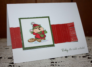
A few months ago, I played along with 365 Card Challenges on a regular basis.  Only because of my crazy schedule, I got away from their fun challenges.  Today, I thought that I would devote a little time to playing along.  Today's challenge is "The 3 F's."  We were to come up with a card that contained fringe, fancy cuts and we were to come up with the third "F."  Cute challenge....anyway, here is my card...
For the fancy cuts, I used my Martha Stewart punches.  The stripe of Cranberry is the made to look like a scarf.  I scored and sanded the strip and then fringed the edges.  My third "F" is the friends sentiment.  It could also be the fur of that cute little beaver, too.  BTW, the sentiment and the beaver are from a Close To My Heart stamp set called Bundled Buddies.  It is so cute, containing several images of little animals all dressed for winter.  The image is colored with my Copics and I added Liquid Applique to his hat and some Crystal Snow on the ground and snowball.

It was fun to play along with 365 Cards once again.  For Now, Happy Crafting!

Monday, November 7, 2011

A Rosette Christmas Tree

Hi everyone...still busy...so what else is new?  I've been working on all kinds of fun projects for my workshops, Michaels Classes and my Artfire Studio.  I thought that I would post one of the cute little projects I've recently completed.

This paper Christmas Tree stands about 6 to 7 inches tall.  Just perfect as a small decoration on your buffet, fireplace or dining table.  Here is how I made it...

1.  You will need to cut 6 strips of paper.    The width of the strips should be graduated.  I used 2 x 12, 1 3/4 x 12, 1 1/2 x 12, 1 1/4 x 12, 1 x 12 and 3/4 x 12. (I used CTMH Olive and New England Ivy)
2.  I punched on edge of each strip using a border punch (I used MS Deco punch)
3.  Using my score board, scored each strip the 12 inch length on the 1/2 inch mark (24 total scores each strip)
4.  Accordion folded the stripes, glued ends together, folded inward to create a rosette.  (I used an 1 1/4 circle punch to help hold together and also used CTMH Liquid Glass as an adhesive.)
5.  When all 6 strips are folded into rosettes,  attached them together in ascending size.  6.  Rim the flower pot in Liquid Glass and set the assembled rosettes on top.
7.  Attach a star to the top.
8.  Using a glue pen, "color" glue on the edges of the branches and sprinkle with Crystal Snow. 

I image that you could use the same procedure and make the tree any size that you wish.  Just remember, if you are making larger rosettes, you will need to increase the length beyond the 12 inches I used.  Feel free to give this cute little tree a try.  For Now, Happy Crafting!

Friday, October 21, 2011

Believe in St. Nick

I know, I know the best intentions to keep this blog updated fell short once again.  I have been soooo busy, I don't even know where to begin.  I'm  teaching all kinds of classes at 3 different Michaels in the Philadelphia area, have 2 new members of the Papers Pads and Pictures CTMH Team, have a card workshop tomorrow...it goes on and on.  No excuse, I need to make time for my blog.

Anyway, I always try to think ahead.  I wanted to get a card done today to show off some of the fun cards we will be making at next month's workshop.  I didn't want to post the cards that we are making tomorrow in case any of the attendees see this post.  Gotta keep the surprise...heeheehee.


This card features an image from a terrific My Acrylix set called "St. Nick."  The pattern paper is from "Believe" and the card stock colors include:  Holiday Red, Sweet Leaf, Topiary and White Daisy.  I just became a Fisk-a-teer a few days ago, so I had to dig out my Threading Water punch.  St. Nick is colored with my Copics.

I really will try to do a better job keeping this blog updated.  I promise.  For Now, Happy Crafting!

Tuesday, October 4, 2011

Close To My Heart Bundled Buddies

Well, I promised that I would do a better job at getting things posted here on my blog and here is my first effort.  Yesterday, I had the opportunity to "play" a little.  Shortly after the new Idea Book was released, I purchased this new, cute stamp set called "Bundled Buddies."  You all know that I love to color with my Copics.  This set is just perfect for coloring. 


I wanted to make Clean and Simple cards to show off how cute the images were.  If you remember, a CAS card is one that has a great deal of white space and the image is the focal point.  On the top card, for fun, I heavily distressed, scored, sanded and fringed the edges of the red strip because I wanted to mimic the look of a scarf.  The second card, I randomly stamped snowflakes that are included in the CTMH October Stamp of the Month called "Holiday Magic."

This set is great for those of us that love to color.  Remember that you don't need to use Copics...you can use your markers and/or water color pencils, too.  For Now, Happy Crafting!

Friday, September 30, 2011

CTMH October Blog Hop!

Wow, where did September go???  As I was preparing for this blog hop, I realized that I haven't posted since the last hop...ahhhh....I have been really busy working on samples, crops, workshops and teaching.  I really must do a better job...  forgive me?  :o)

Just in time for those Holiday Cards, CTMH has created a great Stamp of the Month.  It is called Holiday Magic and contains just about every stamp you could need for terrific Christmas Cards.  What I really like is it has a "split" sentiment.  That is, a set of sentiments that works together for stamping on both the front and inside of your card.  If you've come here from Judy's blog, you are on the right track.  So, without further ado, on to my project.

One of the hottest trends right now in paper crafting is the "Smash Book."  What is a Smash Book you ask?  It is a shabby chic book that is intended to be used!  It contains pockets and placed to immediately attach your fun memorabilia.  For this month's hop, I have created a Smash Book, CTMH style. 


The book is made from white lunch bags!  The bottoms of the bags form the flaps and the tops are left open to store tickets, cards, carry a pen and glue stick.  The book is covered using Winter Wonderland along with Chocolate, Spring Iris, Crystal Blue, Twilight and White Daisy card stock.  The same colors were used for inks and the Trees were stamped using Topiary.  There are several fun techniques included in this book such as sanding, dry embossing, sponging, glittering, paper piecing, repeat stamping and using Liquid Glass to cover the tree on the front cover.  And, of course, I used that wonderful Art Philosophy Cricut cartridge.  Remember, a Smash Book is made so that you can glue cards and trinkets immediately into the book and then journal about them.  That is why there are so many open areas in my book.

It's time to hop on over to Michelle's Blog to see what she has done with this fun stamp set.  For Now, Happy Crafting!

Wednesday, August 31, 2011

Close To My Heart September Stamp of the Month Blog Hop

Hello There!  I missed last month's Blog Hop and it's nice to be back.  This month, Close To My Heart has a very useful and versatile stamp of the month.  It is called "Limited Edition" and it contains tags sentiments and images.  If anyone is looking for a stamp to personalize their work, this is it.  There are journaling lines and even a "save the date" image.  If you've arrived from Susan's Blog, you are on the right hop along track.

As soon as I looked at this stamp set, I knew what I needed to complete.  I created this scrapbook layout in reverent memory of one of America's most tragic moments.

I took this photograph in June 2001 from the deck of a cruise ship as we sailed from the Port of New York to Bermuda.  To this day, I remain astounded by the image I preserved.

The layout is my take on a layout pictured on page 53 of the new Idea Book.  The background is Sorbet card stock and the pattern paper is from Elemental.  The starts were cut using the Art Philosophy Cricut Cartridge and stamped using the set called "Love Life."  I've also used Cranberry, Pacifica and Colonial White card stock and the ink colors are the same with Desert Sand used for sponging and stamping the hand image.   The stamped images from "Limited Edition" include the hand image and "remember."

It's time to hop on over to Paige's Blog to see what she has created.  I always teach that scrapbooking is about preserving our memories.  I can think of no better way to memorialize a day in our history that we shall, nor should we, ever forget.  For Now, Happy Crafting!


Thursday, August 25, 2011

The Art Philosophy Cricut Cartridge Makes Creating So Easy!

I'm having so much fun with the Art Philosophy Cricut Cartridge!  Trendy and sophisticated scrapbook layouts are made easy by using this new tool!
This is my take on one of the layouts featured in the new Fall/Winter CTMH Idea Book.  It features Roxie B/T Duos and one of the new embellishment packs...Bling Assortment.  Roxie is a great combination of Smoothie, Desert Sand, Tulip and Black.  The Bling Assortment is package of terrific crystal buttons and crystal and pearl stick pins.  And those 3D Roses?  Why cut with my Art Philosophy cartridge, of course! 
Making the 3D Roses is easy with the cartridge.  The first thing I tell everyone is NOT to lose the book that comes with every cartridge.  That is your guide for ever available image on the cartridge.  These roses are cut by setting the Cricut on the Font key.  Hit shift and then tell the machine that you want to cut "banner 6."  A spiral shape will be cut.  If you wish, you can ink the edges (like I did in this case) and then just roll the spiral inward.  I hold the rolled shape together with Liquid Glass and you have created a paper rose! 

I've found that I'm creating all kinds of new and wonderful things with the Art Philosophy Cartridge.  If you would like to get one for yourself, visit my website or email me with any questions.  For Now, Happy Crafting!

Tuesday, August 23, 2011

Using Color To Help Convey the Message in Your Projects

As promised, I want to get back to my thoughts on using color to enhance your projects.  Previously we talked about using Reds, Blues and Yellows.  These are the Primary Colors...the three basic colors from which all other colors are derived.  Because of this, a project done using these colors will portray a sense of simplicity and purity.  Think about a Disney Project.  You automatically gravitate to Reds, Blues and Yellows.  Bright and cheery, these colors convey "fun."  Now, think of a  Herritage  project...bright reds, blues and yellows just do not come to mind.  Softer combinations are what you traditionally think.  In a Herritage Layout, you want to create a sense of respect and reverance.  This is achieved by mixing the Primary Colors.

When you mix the Primary Colors, you create what is known as the Secondary Colors.  Think of colors as the numbers on a clock.

I my sample of a "color wheel" blue is at 12:00, yellow is at 4:00 and red is at 8:00.  In your mind, draw a triangle between blue, yellow and red.  You have now connected your Primary Colors.  Because the triangle you have drawn has equal sides, those shades of blue, yellow and red will always work together in your projects.  Now, for the Secondary Colors.  In between blue and yellow, you have green.  That is because, when blue and yellow are mixed together you create green.  The same applies for the orange between the red and yellow and the violet between the red and blue.  Green, Orange and Violet are the Secondary Colors.  In your mind, draw a similiar triangle between green, orange and violet.  The sides of that triangle are equal like the sides of the Primary triangle.  This is a guide for you to use.  Green, orange and violet will always work together in a project because of the equal sides of the Secondary Triangle.

This is a fun note card I created to show how Secondary Colors coordinate on your projects.  Don't you get a totally different feel from the card than a red, blue and yellow card?  The Violet is a CTMH color called Gyspy, the Green is New England Ivy and the Orange is Sunset.  The image is from a stamp set called "Thanksgiving" and is colored with my Copics.

Using colors wisely in your projects is an easy way to enhance the theme and mood of your projects.  Feel free to experiement with color to create your own special mood.  For Now, Happy Crafting!

Monday, August 22, 2011

So Busy With The Art Philosophy Cricut Cartridge

WOW, it's been a long time since I had a chance to update my blog.  But that doesn't mean that I haven't been busy.  I had an Open House, a Card Workshop, taught 2 classes at Michaels and played with my new CTMH Cricut Cartridge.  Have I mentioned that I think it is the best cartridge that I've ever worked with?  :o)

Here are just a couple examples of the fun projects I've created...

I forgot to add that I also am continuing as a Design Team member of Crafting by Design.  What a terrific new website for paper crafters.  Here are two more cards that I made for the site...one is for the fun sketch challenge and the other is for the Copic Challenge.


Please forgive me for not having posted recently.  I have the post almost ready for the continuation of the color series and the Papers Pads and Pictures challenges.  For Now, Happy Crafting!

Friday, August 5, 2011

CTMH Cricut Cartridge and Sonoma Papers

Can I tell you how excited I am about the new CTMH Cricut Cartridge called Art Philosophy?  I know, I've mentioned it several times, but it is just so amazing.  Couple it was the new paper packet called Sonoma and lookie what you can do!
Sonoma is perfect for heritage photos!  I am very fortunate to have many pictures of my Grandmother.  She was born in 1889 and passed away in 1976.  The large photo, I estimate was taken around 1902.  I have dates for the other two...1892 and 1907 (her high school Graduation portrait.)  Just a note about scrapping with old photos...There has been a great deal of chatter about whether to use the original photos or copies.  Many people assert that you should scrap the originals.  If scrapbooking is about preservation of memories, use the originals.  I tend to disagree.  I  scan my originals and print copies.  Here is my thought process....I want the originals to be preserved, so after they are scanned, I store them in a photo safe box and then in a metal box.  You never know if someone else in the family would want a copy of the treasure that you have.  Having had my house hit by a micro burst and severely damaged a number of years ago, I know the importance of preserving special treasures.  When you scrap the copy of an older photo, you don't have the fear of it being damaged or lost.  You also are able to share your with so many more people without concern.  There is no right or wrong answer, this is just my humble opinion.

Anyway, back the the details of the layout.  I used the Art Philosophy cartridge for many of the details.  All of the 3D flowers, and the butterflies were cut using it.  The word "Nana" was cut using the font.  Don't you love the pearl opaque details?  :o)  The cameo is from the new stamp set called "Sweet Memories" but I did use the cartridge to cut the scallop and oval with which it is stamped.  "Remember" and "Sweet Moments" are also from the set.  The flourish is an image contained in a new set called "Love Life." 

I also love the new Heirloom Assortment.  The hanging charm is included in that set along with 3D resin flowers.  Another new embellishment in the Idea Book are Foundry Pins.  See how I have the butterfly attached close to the cameo?  Love it....by the way, I did the hand stitching using Olive embroidery floss.

Two things I need to mention, I've not forgotten the Papers Pads and Pictures Challenge....been so busy playing with the new cartridge that I haven't caught up.  There will be a new challenge coming shortly...thanks for your patience.  Also, I will return to my talk about color theory.  Try to remember this layout in future posts as the Olive and Smokey Plum are a perfect color combo.  If I can answer any questions about the Cricut Cartridge but contact me.  For Now, Happy Crafting!

Monday, August 1, 2011

CTMH Cricut Cartridge

Well, it is official.  Today is the release date of the new Close To My Heart Idea Book.  And, all I can say is wow!  There are so many exciting things in the new book....8 new paper packets, reduced prices on stamp sets and most importantly, CTMH has partnered with Provo Craft and we now have a Cricut Cartridge!  I posted a sample card yesterday but wait until you see what I've done today!

There have been a pile of questions about what size Cricut you need.  While I agree, to maximize the new cartridge called "Art Philosophy" an Expression is best, look what I completed today with my "Baby Bug!"
This card features one of the new paper packets called "Sonoma."  The card is a standard A2 size card in Bamboo.  The pattern paper is from Sonoma.  The focal sentiment image and frame have been cut with the new Cricut Cartride, the flourish has been cut with the Cartridge, the 3D flowers have been cut with the Cartridge along with the frame and oval that I stamped with the matching stamp set called "Sweet Moments."  Wow....I love it!

This fun treat bag was cut using the Cricut.  It is done in Holiday Red.  The pattern paper (scallops cut on the Cricut)  is from a new paper packets called "Believe."  Take a close look....that is a ribbon slide, cut on the cricut along with the star attached to the new pin embellishment.  One of the great things that sets this Cricut Cartridge apart from any other I have ever seen is the MATCHING stamp sets!  Cut the image out and stamp it!
So "Let The Party" begin!  This card base is cut using the card function on the cartridge.  The mats (using a new pack called Roxie) were also cut using the cartridge.  Check out that cut cupcake....yup, cut on the Cricut and stamped with one of the images included on one of the 3 "D" sized stamp sets included in the Cricut Bundle.  I just LOVE the bundle...I know that I am yelling and excited, but I can't help myself.  This is a terrific cartridge....I have had my Cricut since the beginning and this is the best cartridge I have ever seen!

Every project I have posted has been completed with a "Baby Cricut."  Don't fret if you don't own one of the larger machines.  While you won't be able to do everything, these are some of the few projects you can complete.  Don't hesitate....Expressions or Personal Cricut, there are plenty of projects to complete!  For Now, Happy Crafting!

Sunday, July 31, 2011

CTMH Art Philosophy Cricut Cartridge... In with the New and Out with the Old

Tomorrow is the day!  The release of the new Close To My Heart Idea Book.  There are so many new and fun things to share that I am going to deviate from my "Color Use" postings in order to share some of the new goodies.  I'll return to that topic shortly. 

One of the best things in the new Idea Book is the Cricut Cartridge.  It is called Art Philosophy and it is probably one of the best cartridges I have ever used.  Really!  :o)  It has 3D items, cards, a font with a shadow, shapes...the list goes on and on.
When you purchase the Cricut Bundle, you will receive the cartridge, 3 "D" size matching stamp sets and 3 sets of matching chipboard shapes.  Wow...  Everything on this card comes from the Cricut Bundle.  I cut the card base in cocoa using one of the shape features.  The oval, flourish and 3D flowers are also cut using the "bug."  Last but not least, "Happy Birthday" is from one of the included stamp sets.

There have been a lot of questions concerning what size Cricut Machine you need to use the cartridge.  Everything for this card has been cut on a "Baby Bug."  The Baby Bug is the nickname for the original Cricut Machine that was released almost 6 years ago.  You can cut images ranging between 1 inch and 5 1/2 inches (the sizing increases by 1/2 inch except for the the ability to cut 1 1/4 inch images.)  There have been additions to the Cricut Family over the years.  There is a Cricut Create ( not very familiar with that one), the Expression Machine and now the Imagine.  The Expressions will cut images ranging from 1/4 inch to 23 1/2 inches and the Imagine cuts the same size but also includes a printer. 

The stamp sets included with the Cricut Bundle include images that are used to stamp the images once they are cut.  The measurements needed to match the stamp to the cut image are included on the plastic stamp carrier.  Some of the images are sizes that aren't available on the "Baby Bug," but, I was able to create this lovely 5 inch card on the baby bug.  Another thing to keep in mind is the 3D items.  There are such as a Pillow Box and French Fry Box on the cartridge.  You may not be able to cut the items as large as you would like with the smaller Cricut.  While I believe you will have more options with the Expressions Machine, don't feel that you absolutely need the larger machine to take advantage of the shapes in Art Philosophy.  The Baby Bug will still cut all the shapes!

Today is the last day to be able to purchase several of our favorite paper packets like Mistletoe, Olivia and Magnifique.  Also, bulk packs of single color card stock is changing and more importantly the cost is increasing.  If you are looking for bulk packs for Holiday Cards or invites, may I suggest that you order it today before the changes.

As with everything, change is enevitable.  Tomorrow, is the big day for many new products at Close To My Heart...especially that terrific Cricut Cartridge.  Big Bug, Little Bug, you are going to love Art Philosophy.  For Now, Happy Crafting!

Tuesday, July 26, 2011

Enjoy The Ride!

Well, the Close To My Heart Convention is now fading into memory (wish I had be able to attend this year.)  I do have some fun things to share though.  The new Idea Book will be officially released on August 1st.  I have already seen it and I can't wait to share all the goodies.  My shipment of new product is due on Friday, so I will have some great things prepared for Monday!  :o)  One thing I will peak your interest with is the new Cricut Cartridge!  I can't wait to see it in person.  It has 3D items, a font, 3D flowers and all kinds of shapes for our projects. 

Another thing I will share is that 4 paper packs from the current Idea Book will be returning:  Sophia, Mayberry, Fanfare and Lucky.

This card is made using Lucky.  Lucky is a terrific paper packet and just perfect for masculine projects.  The stamp set is used also remains current and is called "Enjoy the Ride."  Some more fun facts about this card...I used Rock and Roll stamping in Outdoor Denim and Olive on the corner stamp.  The bicycle is heat embossed in Outdoor Denim and Gold Embossing Powders.  Olive and Outdoor Denim are 2 colors that work beautifully together because they are what are called analogous colors.  These are colors that rest next to each other on the color wheel.  I will talk more about the color wheel in a later post.

Right now, the most important thing to remember is that the Idea Book will be here shortly....Sit Back and Enjoy the Ride!  For Now, Happy Crafting!

Saturday, July 23, 2011

I'm The Guest Designer....

Just a quick note to tell you that I am the current Guest Designer on the Michelle Perkett Studio.  Michelle hand draws terrific images and turns them into digi stamps.  For those of you that aren't sure, a Digital Stamp is an image that you print from your computer and then color.  This week's theme on the blog is to use a song for your inspiration and used the song "Blowin' In The Wind."  The name of my image is the "Peace Fairy."


Don't forget to check out Michelle's wonderful designs.  For Now, Happy Crafting!

Friday, July 22, 2011

Thursday, July 21, 2011

Making Primary Colors Work For Your Projects

Back when we were in school, we were taught about the "Primary Colors."  Red, Blue and Yellow.  These are the colors that are the base for all other colors.  When we think about the primary colors, we automaticly think bright child like colors.  These colors are easy to work with because we know the mood and message that we are sending...Disney Scrapbook Layouts, School Day Layouts, Children's Birthday Cards.  But this doesn't have to be the case.  There are tints and shades to every color.  When we "tint" a color, the color is lighted by having white added.  When we shade a color, we have darkened it by adding black.  The primary colors are easiest to work with because they are the foundation of the color wheel.  (We'll talk more about that later).  But the primary colors don't have to be childlike and bright.
If you look closely at this card, you'll see that I have used Primary Colors.  The red is tinted with white, the blue has been darken and the yellow is slightly lightened with white.  I don't think this card looks childlike one bit.  What do you think?  By using the basic primary colors in a project, you can easily make a project that will coordinate every time.  I will talk more later about the color wheel and how to always select colors that will complement your creations.

By the way, Close To My Heart Convention is over and the dust is beginning to settle.  There are so many exciting things to tell you about....like a brand new Cricut Cartridge!  I will share more in a later post.  For Now, Happy Crafting!

Thursday, July 14, 2011

Let's Party....The Close To My Heart Convention Has Begun!

The Close To My Heart Convention begins today!  What fun...in the next few days, there will be all kinds of fun and exciting news about new products and tools.  But, the announcement of new products means that some of our favorites will no longer be available.  This year, the outgoing products will be retired on July 31st rather than the customary December 31st.  The new information will be released over the next few days, but I can tell you that there will be eight brand new paper packets!  Of the current paper packets, Lucky, Sophia, Fanfare and Mayberry will remain.  All of our other favorites like Miracle, Mistletoe and Hooligans will no longer be available effective July 31st.
I always got a kick out of this stamp set...Party Animal.  It was a companion to Hooligans and I don't know if it will be available after Hooligans has been discontinued.  The set is so perfect not only for Halloween, but also, birthdays and party invitations. 

My suggestion is to start thinking about anything that you absolutely want before it may be unavailable in August.  As I learn of some of the new products or tools that will be available beginning August 1st, I'll be sure to let you know!  For Now, Happy Crafting!

Using Color To Make Your Projects Pop!

The colors we use in our projects has a definite effect on the message they convey. In the last post, I shared how warm and cool colors effect the mood and appearance of our work.  It all has to do with how the mind perceives the colors.  Cool shades (blues, greens and purples) have a calming effect on our mood while the warm colors (reds, oranges and yellows) evoke a feeling of excitement and movement.  So what happens when we mix cool and warm colors in the same project?
In this card, the main color is the cool color green.  I've used red as an accent on the trim of the hat, mittens, buttons and the heart.  Notice how the red and the yellow stands out?  When you mix cool and warm colors together, the warm colors will visually dominate the project and the cool colors will receed.  This is valuable to remember when you want to highlight a specific element of a project as I did with this one....the heart and the star.

This cute little snowman is "Twinkle" and he is a digi stamp by Michelle Perkett.  You can find more information about her wonderful digi stamps here.  The card is made for her current challenge "Cute as a Button." and information about the challenge can be found at the same link.  The papers are from CTMH's Mistletoe packet and the card stock is New England Ivy.  Twinkle has been colored with my Copics.

Adding a warm color as an accent on a cool color card is a very simple way to highlight an element and make your projects pop!  More on using colors in my future posts.  For Now, Happy Crafting!

Sunday, July 10, 2011

Color and Mood...PPPC #7

As paper crafters, one of the easiest "tools" we have when completing our projects is color.  Color is all around us and what choices we make help to convey the message we are sending in our projects.  Believe it or not, there is "science" behind color theory.  There has been a great deal of research into how color effects our mood and emotions.  Cool colors like greens, blues and purples (think water and pastures) give us the feeling of calm.  Warm colors, such as reds, yellows and oranges (think fire) portray the feeling of excitement and stimulate our senses.  When designing your next project, think about what you are trying to express in your creation.

To demonstrate this, I have created 2 cards....exactly the same but done in different totally different colors...one in warm colors and one in cool colors.
Look at both cards....how do you perceive the one done in Sunset and Black versus the one done in Lilac Mist and Chocolate Brown?  One of the great things about color is that there is no right or wrong answers.  Color is personal preference, but, remember the theory behind how warm and cool colors effect the mood of your projects.  Everyone has a favorite color.  Again, there is no right or wrong answer, but when asked 75% of us will say that a cool color is our favorite.  This is because people naturally seek calm and tranquility that a cool color evokes.  Can you guess what my favorite color is???  :o) 

So, the PPPC this time is to make a project that is either done in warm or cool colors.  If you prefer cool colors, you should make a card using warm colors.  If you gravitate to warm colors, make a card done in cool colors.  I can't wait to see what everyone creates and as time goes on, I will share more insight into color use.  For Now, Happy Crafting!

PPPC #6 Thanks Everyone!

Just a thank you to everyone who participated in our most recent challenge!  What fun, we have a few new participants this go around...I promised Sue that I would post her card because she wasn't able to get it posted (she emailed it to me.)

And, the random winner of PPPC #6.....Jenny!  Congrats to you and we're looking forward to seeing what everyone creates for PPPC #7.  For Now, Happy Crafting!

Friday, July 8, 2011

Wednesday, July 6, 2011

Now That We're Adding Texture To Our Projects, Let's Take It To The Next Level...

I hope that everyone has enjoyed my suggestions on adding texture to your projects, I thought it would be good to take it to the next level.  How do we encorporate this texture in our layout?  Well, I have an example for you...
This card is done on a 5 x 7 inch base of Colonial White.  The striped paper is from a retired (sorry...it was wonderful) CTMH paper packet called Free Spirit.  Because of the subject of the focal image, I wanted to give the appearance of a living room wall.  The stripes reminded me of wall paper.  I added the bottom panel of Indian Corn Blue to mimic wainscoting and the Colonial White crochet ribbon as a chair rail.  To make the wainscoting, I scored the blue panel on the 1/2 mark, repeated it across the length of the panel and sponged it in the same shade ink to add shadow. The subject of your focal image should help you select the right colors for your project. The lamp and table image are "old fashion" looking which is why I chose the softer, heritage colors.  If you were doing a scrapbook layout of little girls playing, these colors would probably not work well.  You would choose hot pinks and bright greens.  Colors that just wouldn't work for this project.   Let your focal image (whether it be a stamped image or photographs) help you select the right colors, papers and texture for your projects.

Play with the textures and colors on your projects.  Think about what your are trying to "say" with your project and textures and colors for your project will become much easier.  For Now, Happy Crafting!

Saturday, July 2, 2011

I'm So Excited!

I don't often put up posts about Close To My Heart specials, but this one is too much fun to let pass.  A couple years ago, CTMH has an adorable paper packet called Animal Cookies.  It was retired last year.  This month, there is a very special deal and it includes the Animal Cookies Creative Basics Kit!  A CB kit includes 12 sheets of pattern paper and a spool of ribbon!  Animal Cookies is one of my all time favorites!  In celebration of the event, I dug out my last 2 pieces of the packet and made this card.
Look how terrific the July Stamp of the Month works with Animal Cookies!  Your technique tips for this card...Rock and Roll stamping and image placement.  I used the large star burst image and first inked it in Dutch Blue.  I then slightly touched it to my Tulip ink pad.  The result is a random mix of both colors.  I also stamped the image off the page.  Don't always think that you need to stamp the full image.  In this case, the full image is a circle.  By only stamping a portion of it, I have created the illusion of movement on the card.

To get your packet of Animal Cookies, all you need to do is place a $50 order with me  and the kit or a few other choices available, can be yours for only $1!  The Animal Cookies Creative Basic kit was such fun for birthdays, celebrations and all kinds of fun projects.  As always, the Stamp of the Month, is only available through the end of the month and you can earn it free with a qualifying order.  I feel quite certain that the return of Animal Cookies will be popular.  Availability is while supplies last or the end of July which ever comes first.

Well, I'm off to get my Animal Cookies kit.  For Now, Happy Crafting!

Thursday, June 30, 2011

CTMH Stamp of the Month Blog Hop

The last day of every month signals the time for a special event....the Close To My Heart Stamp of the Month Blog Hop!  This month it is a stamp set that celebrates the summer season...I say that because here in the United States our set is called "Celebrate America" and the Canadian Consultants have a special set just for Canada.  You can see a picture of the set on my previous post along with the full list of participants.

So without further ado, I bring you my little portion of the blog hop.  If you've arrived here from Susan's blog, you're on the right track.  I wanted to do something fun this month so here is my first project.
I stamped two of the large star images and the fireworks.  Then I triple heat embossed them with clear embossing powder.  To do this, stamp your image.  After you are sure that the ink is dry, swipe your VersaMark pad over the image and cover with the clear embossing powder.  After it has cooled, repeat the process as many times as you like.  This process will make your image appear as if it has been enameled.  Each image was then cut out.  I set eyelets in the stars and attached a pipe cleaner to the fireworks.  The jar is an antique blue Mason Jar that I had in my garage.  I filled it with shredded paper and battery operated lights.  PLEASE if you try this, do not leave the jar unattended.  The lights might get hot and they are resting on paper.  Anyway, I tied the bow with "country" ribbon using my Bowdabra and added the stars and fireworks as I was making the bow.  I attached the bow to the jar and the project was done!  BTW - I tried several different ways to photograph the jar and this is the best I could do to get the lights to show.

My next project is a Christmas Card....yes a Christmas Card.  I wanted to show that just because the stamp set is for July, doesn't mean that you can't use it for other occasions!

The flourish and sentiment are from one of my all time favorite CTMH sets...Snow Flurries.  The star is from this month's stamp of the month!

It's now time to hop on over to Angel's Blog and see what she has created.  For Now, Happy Crafting!

CTMH Stamp of the Month Blog Hop List


Here is the list of all of the participants in the July Stamp of the Month Blog Hop.


Helen Onulak      http://www.hookedonstamping.com/


Kathleen Androlewicz      http://bowlofstamps.blogspot.com/

Judy Burger      http://www.makingtimeformemories.blogspot.com/

Brae Montgomery      http://thebrae-er.blogspot.com

Angela Tutton      http://www.tuttonstreasures.blogspot.com/

Jen Patrick      http://roxybonds-scrappin.blogspot.com/

LeAnne Dudley      http://www.dudleychickdesigns.blogspot.com/

Susan Brooks      http://stampingintheopen.blogspot.com/

Cindy Leek      http://www.paperspadsandpictures.blogspot.com

Angel Sawyer      http://runningwithscissorsdesignco.blogspot.com/

Jen Rubio       http://jenrubio.blogspot.com/

Doreen Guilfoyle      http://whereisyourhappyplace.blogspot.com/

Paige Dolecki      http://paigespaperparadise.blogspot.com/

Sarita Schraeder      http://www.blessedscrapper.com/

Teresa Scrivens      http://www.creatingwithinkypaw.com/

Wendy Fording      http://papercreationsbywendy.blogspot.com/

Kami Welter      http://www.scrappin4memories.blogspot.com/

Melissa Laverty      http://www.fancymelissa.com/

Haley Dyer      http://inkyscrapper.blogspot.com/

Shannon Beck      http://www.cardsfromthefarm.blogspot.com/

Traci Godbee      http://createwithtraci.blogspot.com/

Tamytha Jenkins      http://www.paperheartist.com/

Sheila Bennett      http://sheila-bennett.blogspot.com/

Traci Pasqualone      http://scrapitraci.blogspot.com/

Wanda Riley      http://Creatingwithwanda.blogspot.com

Adeline Brill      http://www.adeline-brill.blogspot.com/

Pamela O'Connor      http://cherishyourmemories.blogspot.com/

Terrie Dodd      http://www.my-life-in-real-time.blogspot.com/

Jill Lucas      http://scrapwench.blogspot.com

Nicole Griggs       http://www.nicolescreativezone.blogspot.com/

Mary Eisen      http://mestamp2.blogspot.com

Carla Ironside      http://carlacreates.blogspot.com

Wendy Coffman      http://www.stampingrules.blogspot.com/

Lisa Sargent      http://lisa-sargent.blogspot.com/

Carol Harris      http://www.carol-harris.blogspot.com/

Debra Van Patten      http://memoriesoftheheartbydeb.blogspot.com

Melinda Everitt     http://ifyoublingittheywillcome.blogspot.com/

Beth Naumann     http://www.bethscreativeblock.blogspot.com/

Nancy Brown      http://creativelyartsygallery.blogspot.com/

Georgia Hauglid      http://inkygeorgia.blogspot.com/

Melissa Robinson      http://www.mlisrobinson.blogspot.com/

Michelle Loncar      http://michelleloncar.blogspot.com/

Dawn Ross      http://iamahappystamper.blogspot.com/

Tammy Lea Pinchard      http://mycreativeclubhouse.blogspot.com/

Katy Donaldson      http://www.scrappinkaty.blogspot.com/

Dawn Heuft      http://stamptildawn.blogspot.com

Annette Green      http://annettescreativejourney.blogspot.com/

Vickie Tagatz       http://create-with-me-vickie.blogspot.com/

Krista Ritskes      http://kristaritskes-simplycreating.blogspot.com/

Shirley Ross      http://www.momnmescrap.blogspot.com/

Lori Brown      http://www.savingmine.blogspot.com/

Vicki Wizniuk      http://wizardshangout.blogspot.com/

Karen Fullam      http://www.enrichingmemories.com/

Sarah Harrington      http://scrapwithsarahm.blogspot.com

Tamra Pope       http://www.tamrascraftypapercreations.blogspot.com

Debbie Little      http://www.makinglittlememories.blogspot.com/

Gina Brandstetter      http://gmbscrapper.blogspot.com/

Lisa Schaefer      http://lisalynn00.blogspot.com/

Jean McNulty      http://stampinmaui.blogspot.com/

Tonya Whitehurst      http://heartandsoulscrappers.blogspot.com/

Amy McVey       http://www.clearlystamping.blogspot.com/

Diana Soling      http://mystampingspot.blogspot.com

Judy Faye Garner      http://judyfaye.blogspot.com/

Wednesday, June 29, 2011

One Last Card About Texture....All In The Ocean!

In the last few posts, I have talked about adding texture to your cards.  Today, I have an example of another way to add texture.
If you look closely, you will see that dots and circles are repeated four times on elements of the project.  First, the pattern paper from CTMH Magnifique, has repeating small circles.  Next, the image (a great digi mermaid from Michelle Perkett...more about that later) has round pearls on her body and handle of her purse.  If you look closely, the Sky blue band has been embossed with circles using a Cuttlebug folder.  And, last but not least, I added a pearl in Eva's hair and three at the bottom to finish off the card.  Repeating the elements in your projects will help with the continuity of the finished item.

Anyway, let me tell you a little about Eva the Glam Mermaid.  I recently found this wonderful digi stamp studio.  All the images are beautifully hand drawn by Michelle Perkett.  Eva is just one of the many Mermaids, Fairies, Angels and you have to check out Woofie!  Here is a link to her inspiration and design challenge studio.  This card is made for her challenge this week...All in the Ocean.  By the way, the image is colored with my Copics.

For Now, Happy Crafting!

Monday, June 27, 2011

A Little More About Adding Texture To Your Projects

The last few days, I have been spending time working on ways to add texture to your projects.  The card that I'm going to share today features "repeating" texture. 

To repeat the texture elements on this card, I used my Swiss Dot Cuttlebug Embossing Folder to add the texture to the black layers.  This is the first repeat.  I then used the flower image from the Close To My Heart stamp set called "Spring Up" (B1365) to make the 3D flower.  This is a terrific stamp set.  The flower image has the dots.  Once stamped, you cut it out along the lines provided and wrap it slightly to form the flower.  I hold it together with either glue dots or Liquid Glass.  The "dots" in the flower image repeat the embossed texture on the black layers.  By the way, the cake image is from a set called "Precious Love" (C1444) and the flowers were colored with my Copics.

I really like how texture adds interest to a project.  What do you think?  For Now, Happy Crafting!

Sunday, June 26, 2011

PPPC#6 - A Summer Theme

It's time for another challenge!  A special thanks to all who participated in the last challenge.  The layouts and cards were wonderful! 

This time, in honor of summer, we challenge you to make a card that features something of the season.  It can be a flower, a card for the 4th of July or perhaps a layout featuring a summer vacation.  The choice is yours.

Here is my card.  The image is from CTMH's set called Theme Park.  It's been colored with my Copics and  little bling has been added with a glitter pen and sparkles.  In a previous post, I talked about adding texture to your projects.  This is another example.  If you look closely, the sweet leaf mat has been run through my Cuttlebug like the previous card, but in this case, I turned the mat over for a totally different look.

Don't forget to add your summer themed projects.  This challenge you are playing for a CTMH Creative Basics paper packet!  For Now, Happy Crafting!

Friday, June 24, 2011

PPPC#5 Post Your Project Here!

Neglected Yellows...A Copic Coloring Challenge

This week's Copic challenge at Simply Scrapping Crafts is to color an image using "yellow."  Such a perfect color choice for summer.  It is also the perfect color choice for me.  For years now, I have collected pineapples.  I'm not quite sure how or why I started liking pineapples other than the fact that they are both the Colonial and Pennsylvania Dutch symbol of "welcome."  Here is my card for the challenge
The card is done on a 5 x 7 inch base of Cranberry card stock.  The large mat is Close To My Heart's new Kraft card stock.  I haven't used it before...what fun to have it in the stash.  This card also features a texture panel for movement on a card.  The outdoor denim panel is scored and then sanded.  By the way, the image was a Christmas gift from a friend a few years ago....love this stamp!

I actually have some sad news about Simply Scrapping Crafts.  Judy, the owner, has decided to close the site effective the end of the month.  What a loss to the paper crafting community as SSC was one of the most friendly websites I've ever been involved with.  Well, the good news, we have one more week to enjoy. 

Thanks to everyone playing along with PPPC.  I'll be back a little later with the next challenge!  For Now, Happy Crafting!

Thursday, June 23, 2011

Trying a New Technique

Gosh, I didn't realize that it has been so long since I posted.  But, that doesn't mean that I haven't been busy.  Friday evening I attended a crop and met a new group of lovely ladies.  I worked on a project that I can't post yet...heeheehee...Saturday I had my Card Workshop.  What fun, we colored all day.  You know, whether it be water colors, pencils or Copics, nothing helps you recapture your youth like coloring a stamped image!  The rest of the time, I have been working on some new techniques to share and to teach at my classes.

Here is a new technique that I played with....adding texture to your focal image.  Texture is so important on your cards and scrapbook layouts.  It helps add movement and interest.  Texture can be added in many different ways.  You can add bling, 3D Flowers, multiple layers, dry embossing and in this case, I actually used my Cuttlebug to emboss my focal image.


This card is actually made for the Simply Scrapping Crafts weekly Copic challenge that will be posted later today.  The challenge this week is to complete a card that uses Yellows in your image.  Believe it or not, the image (from Flower Pot) is actually colored in all yellow or yellow-red shades.  That is the beauty of Copics....with over 300 shades to choose from, your coloring possibilities are endless.  Flower Pot is a current Close To My Heart stamp set that is just perfect for all kinds of coloring.  I have used water color techniques, colored pencils and water based markers to color the image, too.

Don't be afraid to try different techniques.  Sometimes you lose, but more often you'll find something new and interesting.  Remember, our projects are ART!  Art is an expression of our souls.  As paper crafters, we express ourselves on paper!  :o)  For Now, Happy Crafting!

Tuesday, June 14, 2011

A Day of Creativity!

I was stuck at home today while I got my car inspected so I had plenty of time to create.  The first card I made was for the upcoming Thursday Copic Challenge at Simply Scrapping Crafts.  I can't post that card yet, but I promise I will later in the week.

The other day I treated myself to a Copic Air Brush system.  We learned how to use it at the Copic Certification class last week.  I bought the beginner system (ABS-2) because I wanted to see if I liked air brushing before I spent more money.  With this system, the air grip handle screws directly onto a can of "air."  It is a very simple and easy to use air brush.  You merely slid the pens into the air grip and away you go!
To make this card, I used my Nesties to cut the oval.  I randomly stamped a twig image from the CTMH "Something Splendid" stamp set.  When the ink was dry, I grabbed my new air gun.  First I sprayed the upper portion of the oval with BG15 using a swiping motion.  Then I changed the pen color to B21 and sprayed another stripe.  I continued the process with Y38, YG95 and YG99.  When the area was dry, I stamped "dreams" in the upper left hand corner.  The card stock colors include Cocoa, Olive and Honey and the pattern paper is from Mayberry.  The "dots" are Liquid Pearls.  Stay tuned, because as time goes on, I'll explain what the color numbers mean.

Another card I made today is for the current SSC Clean and Simple challenge.  The challenge was to complete a card using buttons...
This is a fun and simple card using images from You and Me, Smiles and Baby Love.  The colors include White Daisy, Hollyhock and Pear.

I hope that everyone had a creative day.  For Now, Happy Crafting!

Saturday, June 11, 2011

Papers Pads and Pictures Challenge #5

It's time for another challenge everyone!  What is your favorite color?  Seventy-five percent of all people say that their favorite color is a cool color....blues, greens, purples....colors that create a sense of calm.  The warm colors often evoke strong emotions.  Colors like red, yellow and orange remind us of warmth and fire.  It's human nature to seek peace which accounts for the overwhelming response of color preference. 

This challenge is for you to create a card using your favorite color combination.  What appeals to you?  What colors together bring you your personal peace?  Create a project that expresses your feelings...

My favorite color combination is "blue and green."  And, I just love turquoise or aqua with darker blue.  This cute little guy is colored with my Copics and matted with CTMH Pacific and Lagoon.  The pattern paper is from the Magnifique Paper Packet.

Nancy will be adding her card as soon as physically possible.  Physically literally....she is down for the count with a hurt knee.  We wish her well and hope that she will be back creating soon!

So, what do you think my favorite color is???  Would you believe that my favorite single color is red!  But, when I create and combine colors, I automatically reach for blue and green.  Your mission is to create a card using your favorite colors together and don't forget to leave a comment about your favorite colors.  Add your card to the link above.  For Now, Happy Crafting!

More Copic Marker Fun!

I'm busy practicing my Copic coloring!  What fun...Here is one of yesterday's cards I completed for the Simply Scraping Crafts Copic challenge...."Pink it Up."

This is just a quick post this morning as I must go to My Studio and do a little cleaning before my next workshop.  We have such fun at our workshops....Here are two of the gals busy working on their projects at a recent class.


Later today, I shall post the next PPPC challenge!  Don't forget to stop by SSC...it really is a great crafting website.  For Now, Happy Crafting!

Friday, June 10, 2011

PPPC #4 A "Z" Fold Card

I'm a Copic Certified Designer!

I had a great day on Tuesday!  I took the Copic Certification Class.  What a fun day and I think my coloring is improving already!  These are the first cards I completed since the class...

Both of these cards were done for challenges over at Simply Scrapping Crafts.  The first card is the design card I did for the Thursday Copic Challenge and the second card is for the Tuesday Color Challenge.

By the way, here I am (looking a little hot and tired) receiving my Certification for Lori, the instructor of the class.
For Now, Happy Crafting!